Changing geom_text color for stacked bar graphs in ggplot()
I have run into the issue, where some labels aren’t showing up/are misplaced for stacked bar charts enough that I decided to document my workarounds. Here is an example graph where the labels aren’t showing up using the iris dataset.

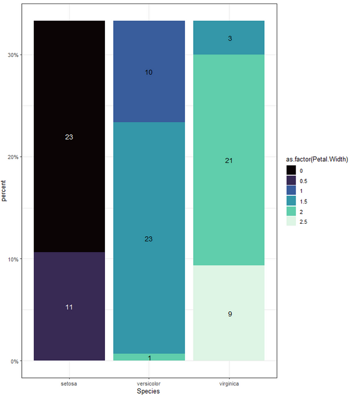
The goal graph is below with conditionally colored labels, where we have white/light labels on dark backgrounds and black/dark labels on light backgrounds.

For this example, I have loaded the tidyverse, viridis packages and am using the iris dataset. Let’s imagine we wanted to plot the percent of each species at the same petal width. First, we would need to reorganize. For sake of this example, I rounded Petal.Width to the nearest .5 for grouping.
iris %>%
  mutate(Petal.Width = round(Petal.Width/0.5)*0.5) %>%
  group_by(Species, Petal.Width) %>%
  summarise(n = n()) %>%
  ungroup() %>%
  mutate(total = sum(n)) %>%
  group_by(Petal.Width) %>%
  mutate(percent = n/total) %>%
ungroup() 
Typically, to create the first graph, I would pipe in the above data frame and use the following code:
ggplot(aes(x=Species, y = percent, fill = as.factor(Petal.Width))) +
    geom_bar(stat = 'identity') +
    scale_fill_viridis(discrete=TRUE, option="mako") +
     geom_text(aes(label=format(round(percent*100, digits = 0))),
            position = position_stack(.5), size =4)+
theme_bw()
Note. The position = position_stack(.5) helps place the labels correctly. Another option is to put a y=... in the geom_text(aes(...)).
However, I have to add some code to the above chunk if I want it to create the second graph:
(1) iris %>%
(2)  mutate(Petal.Width = round(Petal.Width/0.5)*0.5) %>%
(3)  group_by(Species, Petal.Width) %>%
(4)  summarise(n = n()) %>%
(5)  ungroup() %>%
(6)  mutate(total = sum(n)) %>%
(7)  group_by(Petal.Width) %>%
(8)  mutate(percent = n/total) %>%
(9)  ungroup() %>%
(10) mutate(color.group =
(11)          if_else(as.numeric(Petal.Width) <= .5,
(12)         'group1', 'group2')) %>%
(13)  ggplot(aes(x=Species, y = percent,
(14)             fill = as.factor(Petal.Width))) +
(15)  geom_bar(stat = 'identity') +
(16)  scale_fill_viridis(discrete=TRUE, option="mako") +
(17)  geom_text(aes(y = percent,
(18)               label=format(
(19)                       round(
(20)                           percent*100, digits = 0)),
(21)                group=as.factor(Petal.Width),
(22)                color = color.group),
(23)            position = position_stack(.5), size=4)  +
(24)   scale_color_manual(values = c('white', 'black'))+
(25)   scale_y_continuous(labels = scales::percent)+
(26)   guides(color = "none") +
(27)   theme_bw()
Some of the key features are in the aes() of geom_text() :
Line 17: y = percent places the y-axis, but also helps ggplot() know where along the y-axis to put the labels.
Line 21: group = ... allows you to group by your legend (whatever you have in the global aes(fill = ...).
Line 22:color = ... creates groups to color your label text by. If you don’t later put guides(color = 'none' or FALSE) you’ll get another legend that’s not necessary. You have to create the grouping for color() which was completed in lines 10–12 for this example.
Line 23: position = position_stack(.5) tells ggplot() to put the labels in the center of each stacked bar. You would change this to dodge if you weren’t using a stacked bar graph.
Line 24: After geom_text() , I added scale_color_manual() which specifically relates to the arguments in my geom_text(aes(color...)) argument (aka color.groups ). Color.groups can be called anything you want and you can have as many as you want, but the order in which the factors in that column are organized will correlate to the order in values = c(...) . Therefore, in this example, group1 will have white and group2 will have black labels. For the Viridis scale, the first two colors are dark (or anything under .5), which explains my decision-making in the if_else() function (line 10–12) in my mutate function that creates color.groups. This will be specific to your color scale though and you will likely need to manipulate that line of code separately.